UI DESIGN
UX RESEARCH

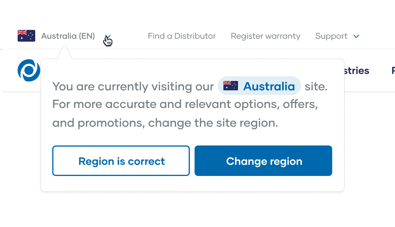
Improving the country picker experience on Pacvac’s website
Pacvac’s region switcher caused layout shift on load, leading to failed Core Web Vitals and user confusion — especially on mobile. I proposed a new region switcher experience that improved usability, reduced CLS, and better supported international growth.
Role
Lead Designer
Timeline
2.5 months
Type
B2B
Industry
Manufacturing
Problem
Pacvac is a global brand with region-specific product availability and pricing. Users must select their country to view the correct store and content.
However, the existing region switcher (country picker) was:
Causing layout shifts (CLS), affecting performance scores (Core Web Vitals)
Unclear in behavior — some users didn’t realize they had to switch regions
Breaking user flow — changes mid-session led to lost carts or redirected pages
This had both UX and conversion implications, especially as Pacvac expanded into the UK.
Problem Framing
User problem:
Cumulative Layout Shift (CLS) disrupts page load and user experience.
Modal only appears once; no easy way to change country again.
Poor mobile layout: dropdown and button are side-by-side, violating tap target accessibility.
Visual hierarchy unclear; not optimized for quick decision-making.
Business impact:
Incorrect region = incorrect pricing, shipping, or product availability.
Missed opportunity for personalization or regional funnel optimization.
Drop in conversions or increase in bounce rate due to layout instability.
By meeting users where they are, we create a more cohesive and spiritually-centered journey. It also positions HalalTrip as more than a travel tool. Now Halaltrip becomes a faith companion, offering meaningful value beyond logistics and gaining a competitive edge over single-purpose apps.

Scope
Our mobile experience suffered a CLS of 0.93, significantly over the recommended 0.1 threshold. This not only failed our Core Web Vitals assessment but also risked frustrating users with jumpy interfaces — particularly on first load when the region selector modal appeared.”
My Roles & Responsibilities
As Lead Designer, I directed the design vision, guiding four designers across research, design, testing, and handoff. I ensured alignment, quality, and speed while partnering with developers and marketing to maintain feasibility and brand consistency—driving clarity, fast decisions, and adaptability.
Constraints
Despite the challenges, I helped steer the team by streamlining workflows, doubling down on core user value, and maintaining tight stakeholder alignment to move fast without losing focus.
1
Tight Timeline
Three months to ship. We had to design fast without compromising user value.
2
Limited Budget
A small budget meant cutting non-essentials and focusing on the highest-impact features.
3
Resource Constraints
Only two developers. Every feature had to be scoped for feasibility and speed.
4
Changing Requirements
Midway, several confirmed features were deprioritized or replaced. We absorbed changes with minimal disruption by aligning quickly and adjusting scope.
Why CLS Matters for Pacvac Users
Cumulative Layout Shift (CLS) measures how visually stable a page is while it loads. A high CLS means elements shift around — buttons move, content jumps, or modals push down other sections unexpectedly.
For Pacvac’s user base, this isn't just annoying — it can directly impact trust, task efficiency, and conversions.
👷♂️ B2B Customers / Owner-Operators
These users are:
Often time-poor and navigating during work breaks or on job sites
Looking for specific information fast (e.g. specs, prices, warranty, where to buy)
More likely to abandon a site that feels unstable or clunky
Why CLS is a problem for them:
Shifting layouts make it hard to click the right CTA quickly
Can accidentally click the wrong region or product category
Undermines the professional credibility of a commercial-grade brand
“If Pacvac’s website jumps around while I’m trying to check product details or pricing, I start wondering if the vacuums are as reliable as they say.”
🛍️ End-Consumers (growing D2C)
As Pacvac grows its direct-to-consumer business, these users expect:
Polished, smooth experiences (like what they get on Dyson or Apple’s websites)
Mobile-first speed and visual stability
Why CLS is a problem for them:
Layout shifts feel jarring or amateur, breaking emotional confidence in the product
Affects perceived speed and quality
May lead to frustration before purchase
Why CLS Matters for Pacvac Users
“For Pacvac’s customers — whether a facilities manager looking for a fleet purchase or a small business owner buying a single backpack vacuum — the site needs to feel fast, stable, and reliable. A high CLS undermines that. By reducing layout shift, we not only improved technical performance but aligned the digital experience with the quality Pacvac promises in its products.”
Users & Audience
Our core users are Muslims aged 18–34 who rely on digital tools to support Quran learning, teaching, and recitation. Most have basic digital literacy and prefer straightforward, purpose-driven tools over complex platforms. They aren't just users—they're learners, educators, and explorers looking for guidance, consistency, and credibility in their spiritual journey.

SELF-TAUGHT AND LEARNING
Casual Learners
Busy young adults and working professionals who want to reconnect with the Quran. Often self-guided and time-poor.
KEY NEEDS
Fast access to recitations and translations, intuitive UI, and gentle nudges to build reading habits.

SEEKING DEEPER UNDERSTANDING
Dedicated Students
Individuals actively studying Quranic Arabic, Tajweed, or Tafsir. They prefer features like bookmarking, structured learning paths, and audio recitations from trusted scholars.
KEY NEEDS
Advanced search for translations and tafsir, bookmarking, slow-speed recitations for practice.

THE KNOWLEDGE BEARERS
Quran Teachers & Religious Educators
Instructors who teach Quran recitation, memorization (Hifz), and Islamic studies. They may need tools for lesson planning, assigning readings, or audio playback features for students.
KEY NEEDS
Lesson planning tools, ability to assign readings, audio playback controls, credibility of sources.
Our Design Process
This is an overview of our process for this project. While it may look linear in this presentation, our approach was actually iterative. We constantly revisited previous steps, making adjustments and refining our direction as we uncovered new insights. It was a flexible, evolving process rather than a straight path.
For a more detailed walkthrough of each step, please find my case study presentation here.
1
Requirements Gathering & Project Kick-off
Details
2
User Desk & Research
Details
3
Ideation
Details
4
Design
Details
5
Usability Testing
Details
6
Developer Handoff & Iteration
Details
KEY INSIGHT #1
Users face fragmented, frustrating, and often inaccessible Quran app experiences.
From missing features and clunky interfaces to barriers like Tajwid difficulty, wudhu requirements, paywalls, and distractions, most digital Quran apps fail to support focused, comfortable, and spiritually fulfilling use—especially for travelers.
KEY INSIGHT #2
Users prefer digital Qurans for their flexibility, especially when traveling, but still value physical copies for deep, undistracted study.
Features like bookmarking, adjustable fonts, and last-read tracking support accessibility and convenience, particularly for older users. However, notification distractions and a desire for deeper engagement (like talaqqi) still drive many to switch back to physical Qurans during focused reading.
KEY INSIGHT #3
Users engage with the Quran in diverse ways, shaped by personal learning styles, interface preferences, and daily rhythms.
Some focus on memorization through repetition or audio recitation, while others prioritize interpretation. Reading often happens after prayers or during free time, with 38% reciting daily. Preferences vary between scrolling and page-flip formats, and many users seek pronunciation guidance or teacher-like support to stay motivated.
KEY INSIGHT #4
Users seek more thoughtful, feature-rich Quran apps that support understanding, continuity, and personalization.
Top priorities include bookmarking to track reading progress, integrated translation and tafsir, and tools for annotating and organizing notes. Users also want accurate Tajwid support, smart search, dua collections, and reminders to help maintain consistent recitation habits—ideally in a private, distraction-free environment.
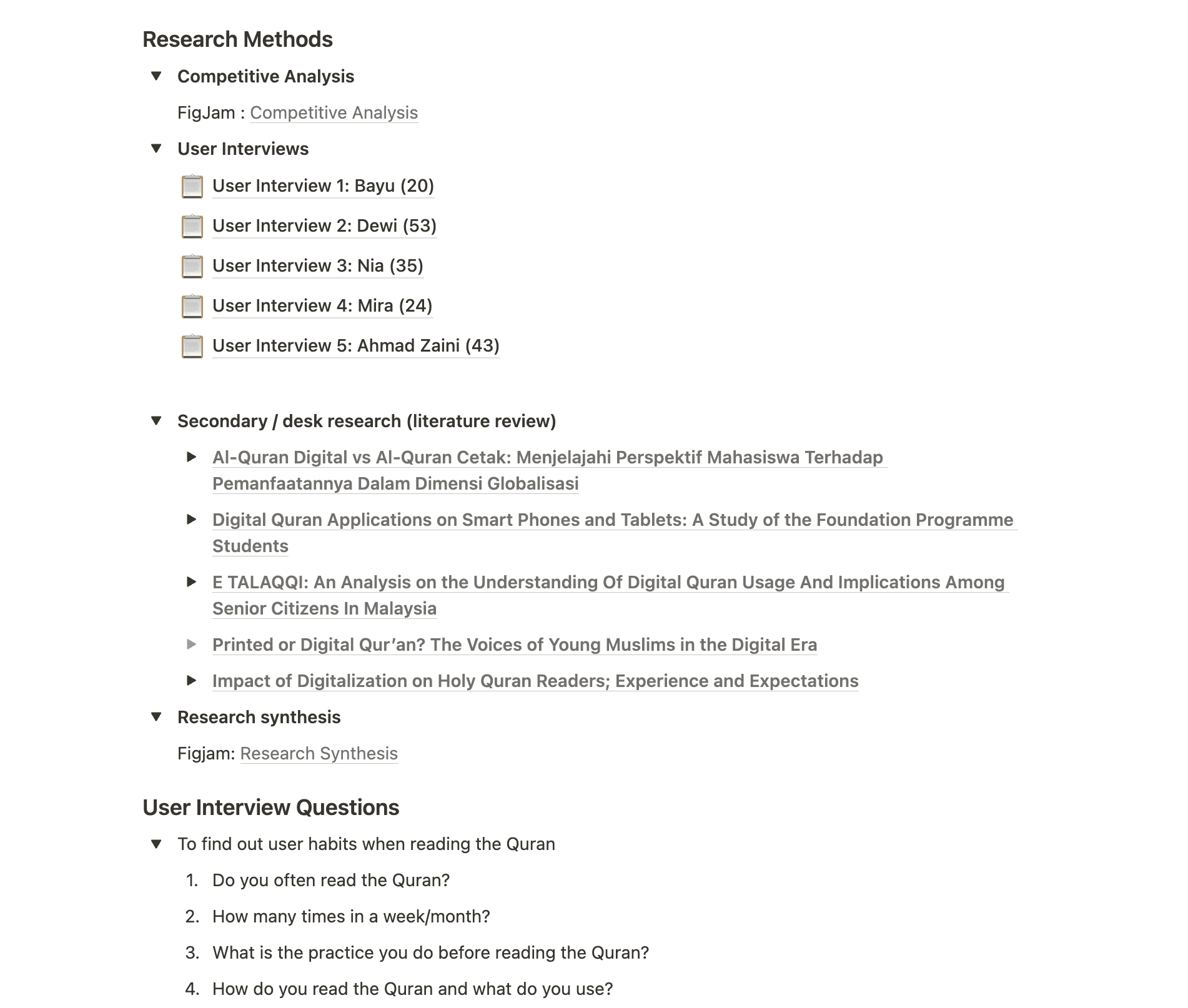
Research Methods
Competitive analysis
We conducted a competitive analysis of six popular Quran apps—including Qur’an Kemenag, MuslimPro, and Quranic—focusing on features, usability, UI design, and engagement strategies.
This helped us identify UX gaps, best practices, and opportunities to differentiate HalalTrip’s experience in a crowded app landscape.


In-depth interviews
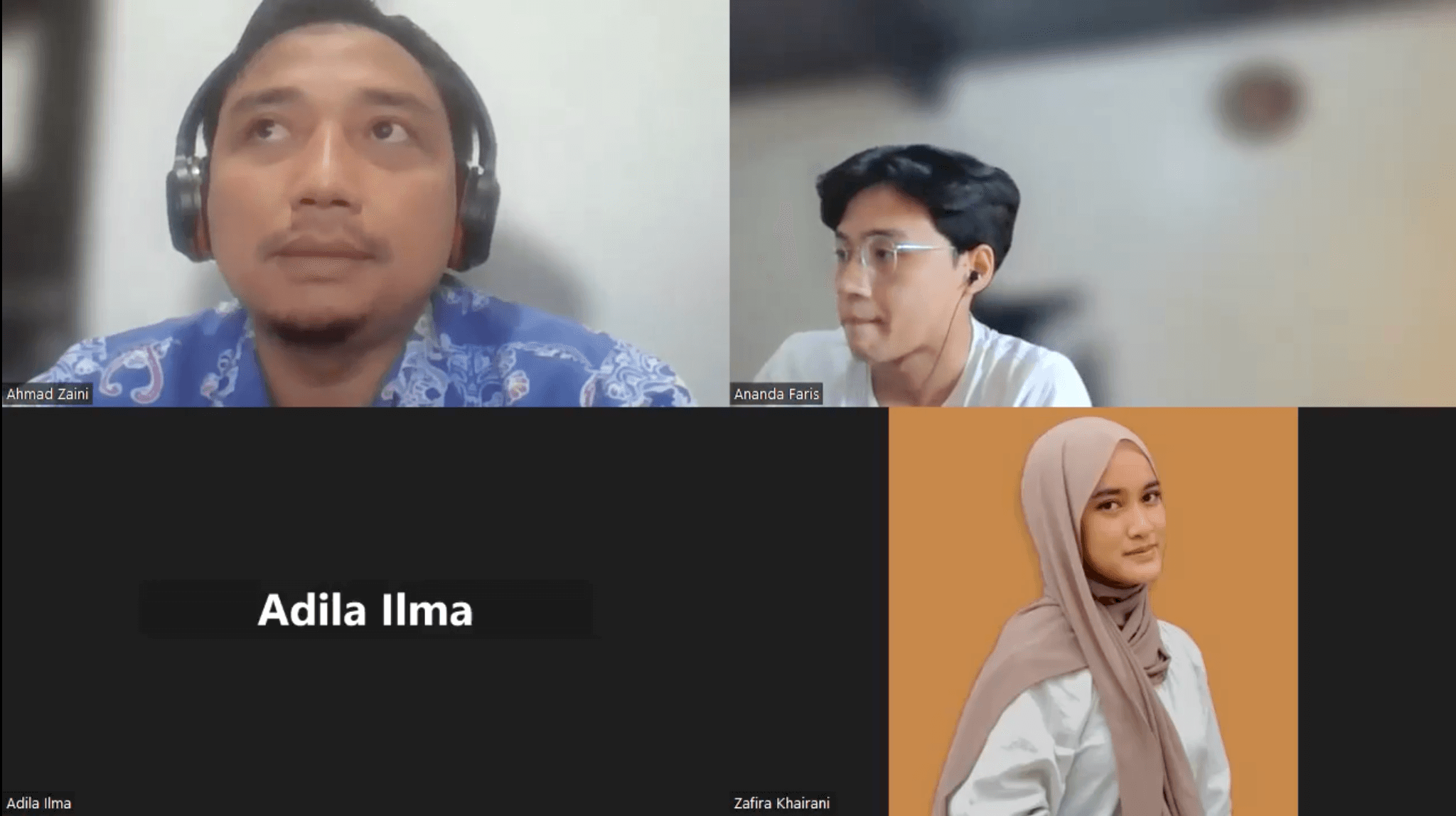
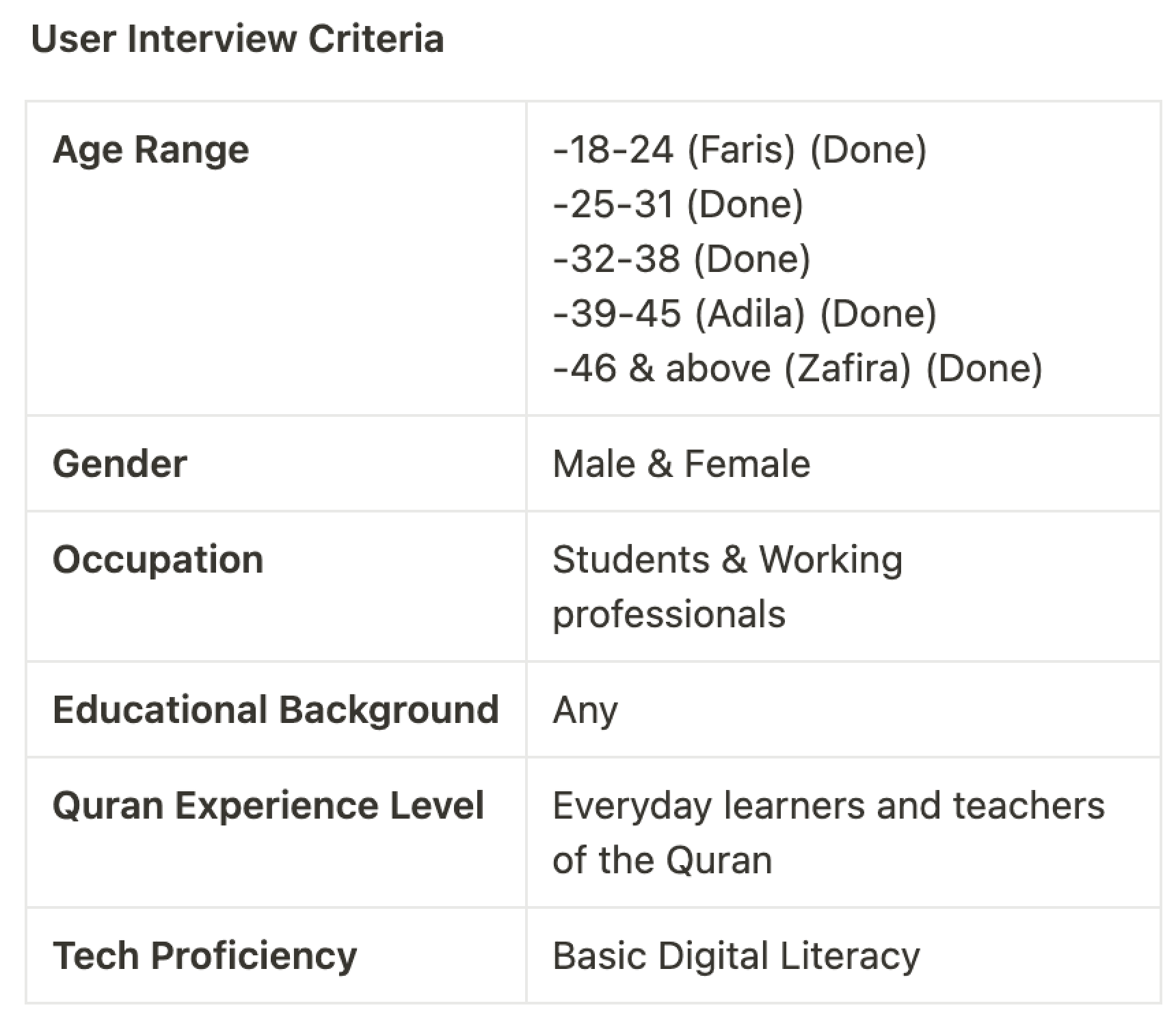
We ran five remote user interviews over one week, each lasting 30 minutes via Google Meet.
To ensure rich insights and smooth facilitation, each session had a dedicated moderator, notetaker, and backup designer, with stakeholders invited to observe live. This setup not only enhanced collaboration but also built stakeholder empathy early in the design process.
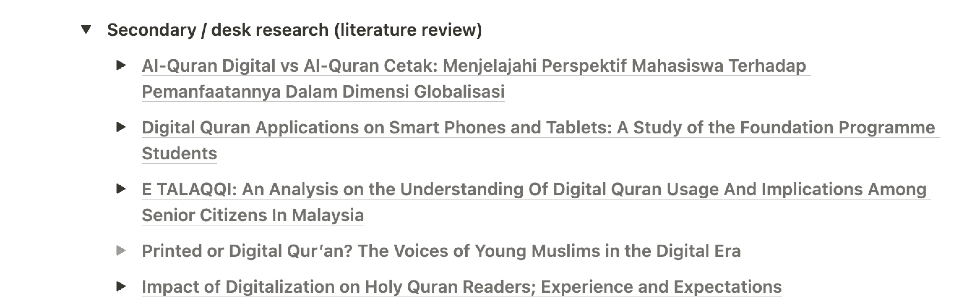
Secondary/desk research
We conducted secondary research to deepen our understanding and validate early assumptions.
This included reviewing academic journals and published studies to uncover evidence-based insights that could inform both design decisions and problem framing.
HMW QUESTION
How might we design a digital Quran experience that supports learning, memorization, focus, and daily continuity—while making it easier for users to engage deeply with the Quran through accessible tools, guided learning, and meaningful personalization?
Prioritizing What Matters Most
With key user needs framed through a series of "How Might We" questions, the next step was to translate these insights into actionable, prioritised features.
To avoid scope creep and ensure we were solving the right problems first, we used the MoSCoW Method—a simple but powerful way to sort features based on their viability, desirability, and feasibility.
Priority Level
Feature
CRITICAL FOR MVP
Must-Have
Bookmarking, last-read tracking, reciter selection, translation & tafsir, offline mode.
ENHANCES UX
Should-Have
Annotation & note-taking, adjustable fonts, distraction-free mode (Focus Mode).
NICE TO INCLUDE LATER
Could-Have
Progress tracking, reminders, rewards system.
OUT OF SCOPE FOR NOW
Won’t-Have
AI-assisted tafsir/interpretation, community discussion features.
Key Screens
INCREASING ENGAGEMENT
Engagement Features
To enhance engagement and retention, we introduced streaks and a goal tracker to encourage users to return consistently. This feature was heavily inspired by Duolingo's approach to habit formation and user motivation.


ENGAGE & PERSONALIZE
Goal Setting Feature
To support habit formation and improve user retention, we introduced a goal-setting feature that adapts to each user’s preferred reading pace. By breaking down the Quran completion journey into manageable milestones, users can track progress on their own terms, therefore making it easier to pause, resume, and stay motivated over time.
CLEAN & NON DISTRACTING
Reading Experience
The reading interface is intentionally minimal to reduce cognitive load and keep users focused on the verses.

MORE PERSONALIZATION
Collection & Saving Feature
To drive retention and deepen engagement, we introduced a Save Verse and Collections feature that allows users to bookmark meaningful verses into personalized collections. This reduces friction by eliminating the need for manual search, making it easier for users to revisit and reflect, encouraging repeat app usage and long-term habit formation.

Outcomes
We shipped it on time!
We shipped the V1 MVP design on time, and at the time of writing, it’s now in Beta; actively being tested and iterated based on real user feedback.
20% Surge in Quran Searches Validates User Demand
Since announcing the feature, we observed a 20% increase in Quran-related searches on our website—reinforcing user interest and highlighting the feature’s potential to drive deeper engagement and conversion.
Great user enthusiasm and excitement
Although the feature hasn’t been publicly launched yet, our early announcement at halal travel expos generated significant buzz and directly contributed to a spike in app downloads. The strong interest from both event attendees and partners indicates clear market demand and validates the strategic value of investing in faith-based user journeys.